
Same frustration, different era – why bad error messages still hurt UX
Sound familiar? You try to change your password, carefully enter the new one, and the system responds:
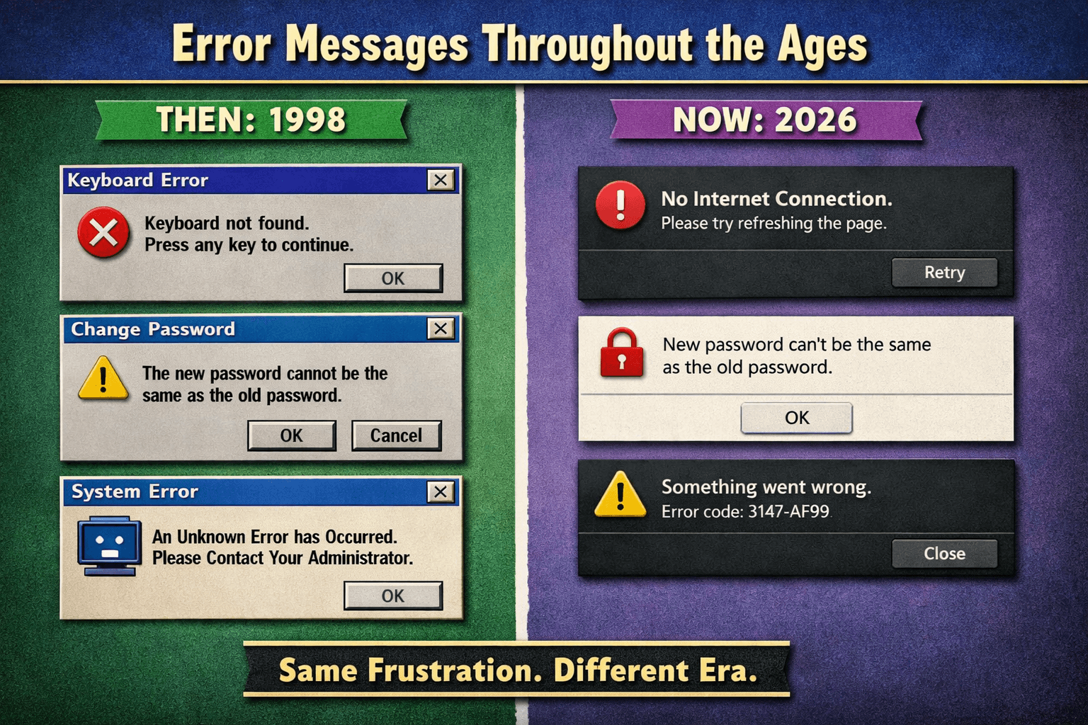
“The new password can’t be the same as the old one.”
Even though you don’t remember the old password at all. You can’t see it, you didn’t intend to reuse it — yet the system blames you. 😅
Retro flashback: when computers trolled us
Many developers remember this legendary message:
“Keyboard not found. Press any key to continue.”
No keyboard — yet you’re asked to press a key. A perfect logical paradox from the 90s.
Modern UI, old thinking
Today we have beautiful interfaces and smooth animations, but error messages often remain unhelpful:
- “No internet connection. Please refresh.”
- “New password can’t be the same as the old one.”
- “Something went wrong. Error code: 3147-AF99.”
Users don’t care that something failed — they care about what they can do next.
The real problem is UX, not technology
Error messages are usually written by developers for developers. Systems know exactly what happened, but fail to explain it in human language.
A good error message should:
- clearly explain what happened,
- suggest the next step,
- help prevent the issue in the future.
The WebDevs mindset
At WebDevs, we believe great UX goes beyond visuals. Clear communication is just as important as design and performance.
Good products don’t just work — they guide, help and respect users.
Same frustration, different era
Technology keeps improving. Hardware gets faster, software gets smarter — but bad error messages stubbornly survive.
The frustration remains. Only the era changes.